Most rooms that feel wrong are not badly furnished — they are badly matched. Colour is what ties a space together or leaves it feeling accidental. The good news is that choosing a palette is a method, not a talent. Here is a simple, repeatable way to pick colours that work.
Start from something you already own
Do not start from a paint chart. Start from a thing you love and want to keep: a rug, a piece of art, a favourite textile. Pull three colours out of it — a main, a secondary and a small accent. A palette drawn from one object you already love will always feel connected.
Use the 60 / 30 / 10 balance
A room feels settled when its colours are not used in equal amounts. A reliable balance is:
- 60% a main, quiet colour — walls and large furniture.
- 30% a secondary colour — a sofa, curtains, a rug.
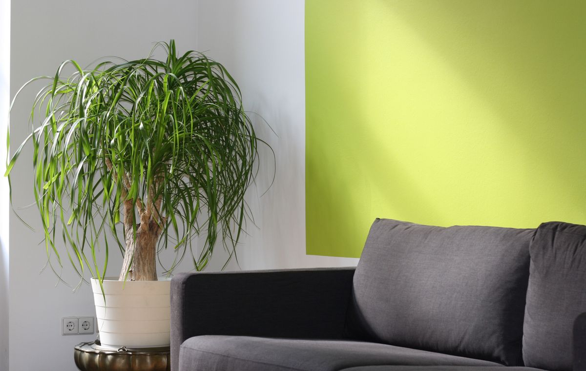
- 10% an accent — cushions, art, one bold object.
Keep the accent small and it stays exciting. Spread it everywhere and it stops being an accent.
Pick an undertone and stay with it
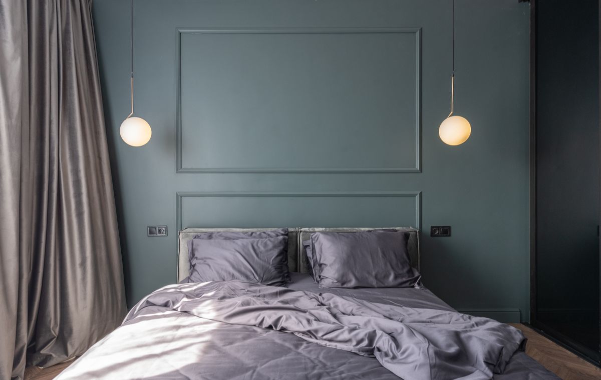
Every neutral leans warm or cool. Warm whites and greige feel soft and cosy; cool greys feel crisp and modern. Choose one direction for a room and let your whites and neutrals agree with it. Mixing warm and cool neutrals is what makes a space feel slightly off without you knowing why.
Test before you commit
- Paint a large sample on the wall, not a tiny patch.
- Look at it in morning light and again at night under your lamps.
- Live with it for two days before buying a full tin.
Let one room lead into the next
A home feels calm when its rooms share a thread. Carry one colour from your palette into every room, even in a small dose, and the whole place reads as one considered home rather than a series of separate decisions.
You do not need more colours. You need a few that agree with each other.
Ready to put a palette to work in one room this weekend? Our guide Small Space, Big Style gives you a step-by-step plan and a printable brief, with a free three-page sample to try first.